In the ever-evolving landscape of digital technology, responsive web design has become more than just a buzzword; it’s a fundamental necessity. With the majority of internet users accessing websites through mobile devices, tablets, and various screen sizes, ensuring a seamless and user-friendly experience has never been more critical. In this article, we will delve into the significance of responsive web design, not only for enhancing user experience but also for optimizing SEO performance.
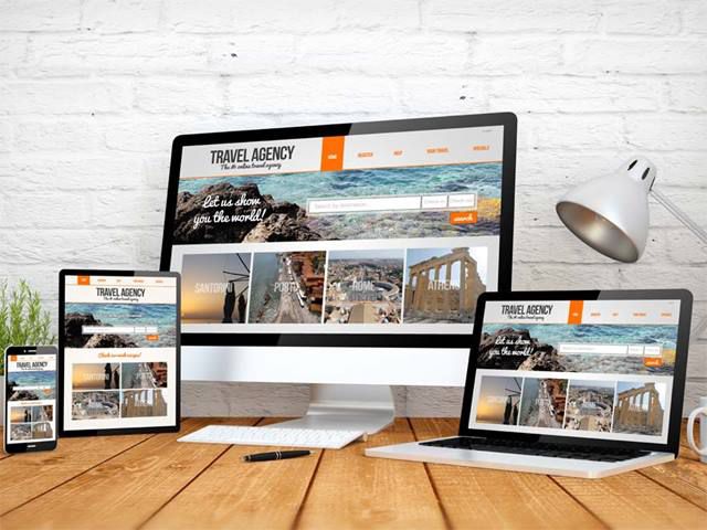
What is Responsive Web Design?
Responsive web design is an approach to web development that aims to create websites capable of adapting and rendering optimally across a wide range of devices and screen sizes. Instead of building separate versions of a website for different platforms, the responsive design utilizes flexible grids and layouts, media queries, and scalable images to ensure that the content adjusts dynamically to fit any screen.
The Mobile Revolution
The proliferation of smartphones and other mobile devices has transformed the way people access the internet. According to Statista, mobile devices accounted for approximately 56% of global website traffic in 2021. This statistic underscores the importance of catering to mobile users.
A responsive web design ensures that your website remains accessible and functional on smartphones and tablets. This not only provides a better user experience but also reflects positively on your brand’s credibility and professionalism. When users encounter a website that is difficult to navigate or read on their mobile device, they are more likely to bounce off, leading to a higher bounce rate and potentially lower search engine rankings.
SEO Benefits of Responsive Web Design
Responsive web design goes hand in hand with search engine optimization (SEO). Google, the dominant search engine, has made it clear that mobile-friendliness is a crucial ranking factor. Websites that are mobile-friendly tend to rank higher in search engine results pages (SERPs).
Here are some ways in which responsive web design contributes to SEO:
1. Improved Page Load Speed
Responsive websites are optimized for various devices, which often means they are designed to be lightweight and load quickly. Faster-loading pages are favored by search engines, as they provide a better user experience.
2. Reduced Bounce Rate
A responsive design ensures that users can easily navigate and engage with your website regardless of their device. This reduces the bounce rate, indicating to search engines that your content is relevant and valuable to users.
3. Avoid Duplicate Content Issues
Having separate desktop and mobile websites can lead to duplicate content problems, which can harm your SEO efforts. Responsive design eliminates this issue, as you only have one website to manage and optimize for all devices.

4. Mobile-First Indexing
Google has shifted to a mobile-first indexing approach, which means it primarily uses the mobile version of a website for ranking and indexing. If your website is not mobile-friendly, it may struggle to rank well in search results.
5. Enhanced User Engagement
Responsive design fosters a positive user experience, encouraging visitors to stay longer on your site, explore more pages, and interact with your content. These user engagement signals are valuable for SEO.
Conclusion
In a digital landscape where user experience and search engine visibility are paramount, responsive web design stands as a crucial component of a successful online presence. It not only ensures that your website is accessible and appealing to users across devices but also contributes significantly to your SEO efforts.
Investing in responsive web design is a strategic move that not only benefits your audience but also your bottom line. As search engines continue to prioritize mobile-friendliness, businesses, and website owners cannot afford to neglect the importance of responsive web design. Visit Make Easy Life where you will find lots of great information and practical advice about the importance of responsive web design.
Remember, in the online world, the first impression matters. Your website is often the first point of contact between your business and potential customers. Make it count by embracing responsive web design.